No matter who we tax, or how high or low we set tax rates, federal tax receipts barely budge when measured against the entire economy. This fact flies in the face of political arguments about tax rates: who should pay their fair share, whether corporate taxes are too high or too low, or how to handle federal deficits. This chart shows federal tax receipts as a percent of the US’s gross domestic product – which is our entire economic output.
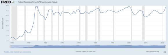
For tax historians, a few facts stand out:
- The Trump administration passed a tax package in 2017; rates have not changed since then. This was widely perceived to be a tax cut. Yet tax receipts have reached the very highest edge of the long-term range since the 1940s.
- In the 1970s, the top marginal rate was 70%. Did that help? No. Tax receipts as a percent of GDP were never more than 18% that decade and were frequently lower.
- Tax rates declined in 1982. The marginal rate dropped to 50%. (For reference, today’s top federal rate is 39.6%.) Tax receipts hugged the 17% line all decade.
- In the mid to late 1940s, the highest marginal rate was over 90%, and the federal government had changed income brackets so that rate kicked in at $200k, instead of $2 million. The economy peaked right around 1945, and from then on, “tax the rich, more” resulted in an ever-decreasing take as a percent of GDP – despite the end of WWII.
- The shaded grey vertical lines represent recessions. Around nearly every recession – no matter what the tax rate – the Fed’s take declines. One of the worst outcomes ever for tax receipts was the recession of 2008-2009. Throughout that period, the highest marginal rate was 35% – it never changed.
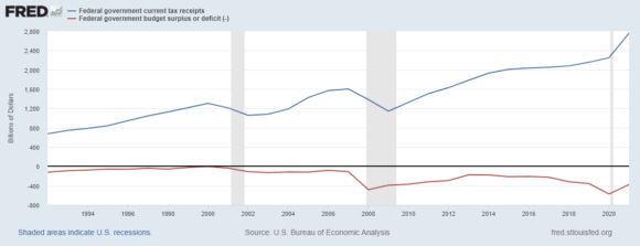
- Below, tax receipts are compared to budget deficits. This chart speaks for itself. Despite the highest receipts ever, our budget deficits are also higher than ever.
Lessons are two-fold: first, we haven’t found an optimal tax rate yet, in all these years of trying. Second, recessions matter – far more than tax rates.